Table of contents
TLTR
Is creating a minimalist website truly simple? Behind what might appear as a purely design choice lies much more. Let’s explore it together.
What is Minimalist Web Design?
Have you ever heard the phrase “Less is more”?
This phrase is one of the cornerstones of minimalism, an increasingly popular trend in design (whether it’s fashion, interior, or web) that borrows its philosophy from certain past artistic movements. “Less is more” translates to the principle where everything unnecessary is eliminated, privileging the essential.
We’re not talking about a purely aesthetic choice: design for the sake of design isn’t design.
The minimalist principle in web design translates into the ability to integrate and harmonize aesthetic aspects with usability and efficiency, the latter understood as the ability to achieve more with minimal resource waste.
Often, in the process of creating a website, there’s a temptation to fall into a kind of horror vacui, inserting bold animations or unnecessary design elements, thinking that opulence equates to functionality.
In reality, research suggests the opposite: a user judges a website in 1/50 of a second. In this blink of an eye, visual complexity is negatively judged by users who have become more aware (or perhaps just more accustomed) to preferring clean design.
Citing NNGroup, the term “minimalism” is widely used, but it’s difficult to pinpoint exactly what defines minimalist web design.
Typically, it translates to the use of thin lines, geometric shapes, and concise, short texts with well-selected typography. One thing is certain, though – each of these elements is designed and placed with one goal: to prioritize content and the browsing experience.
Let’s look at some common characteristics of minimalist design to understand how they can enhance website usability.
What are the Fundamental Elements?
Negative Space
“Negative space” refers to the empty space around elements on a web page. Similar to a tidy room, empty space enhances readability, provides clarity, and makes individual elements more prominent. Moreover, “whitespace” and voids structure the browsing experience, improving it. In essence, empty space doesn’t mean wasted space, but rather a better user experience.
Consider one of the world’s most widely used search engines that achieved its fame in part due to its simple design.
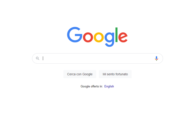
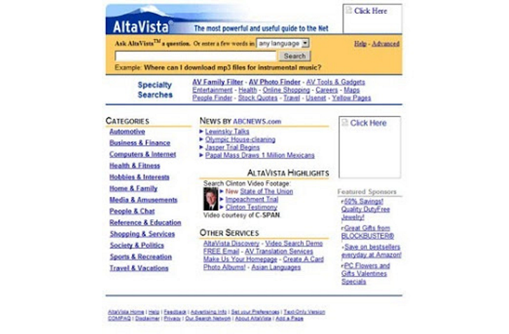
Google changed our expectations when it comes to search engines, but this now-familiar minimalist design was quite different in the past.
Initially, portals were filled with information: in order to display all the elements, search result pages loaded very slowly and often distracted users from their main search intent.
Google’s homepage, on the other hand, was designed entirely around its central search function: everything unnecessary was removed except for the brand, which was further emphasized by this solution.
Dramatic Typography
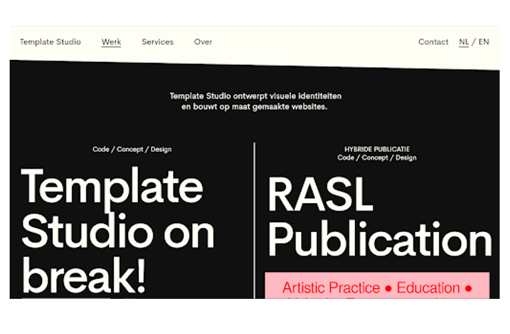
The choice to use dramatic typography (oversized fonts or very reduced fonts, text on images, visually appealing and easy-to-read fonts) is one of the keys to success in design. In web design, this becomes even more important: text is one of the few components we have to dominate negative space, and it becomes a precious element of visual and verbal communication. It allows us to explore the interaction between what the text literally says and what the typeface expresses – a bit like when we read the same sentence aloud using different tones.
Because of this, the use of dramatic typography must always be careful and attentive to content: the emphasized message or action must be communicated visually effectively, or we risk eliciting inadequate emotions and sensory responses (much like when we see something written in Caps Lock).

Contrast
Contrast is the ratio between the color of text and elements and the background color. Using a color scheme with strong contrasts is a good choice for a minimalist website. It not only provides a fresh and modern appearance, but also contributes, like negative space, to improving readability and guiding users’ navigation path towards important information or a specific action (as in the case of call-to-action buttons).
Limited Color Scheme
Negative space doesn’t necessarily mean just white or black. It’s not necessary to avoid adding a bit of color to a minimalist website. However, minimalist designers tend to select a limited color palette. Color has the power to add visual focus to content, but it can also distract users. It’s better to play with a color scheme that highlights only one color or at most two.

The fifth point in our list is related to the concept of simplicity in minimalist web design, and we want to delve a bit deeper into it.
Simplicity: The Key to Minimalism
“The worst feedback you can ever get from a client is it looks like you work really hard on this. (…) The irony of what we do (design) is if we do it right it looks like it was effortless”
Mike Monteiro, 13 Ways Designers Screw Up Client Presentations.
Creating something simple is actually extremely complex. Let’s start with definitions: in the context of web design, what can be considered simple?
Aesthetically, it refers to a clean and elegant layout with a consistent color combination. In addition to the visual aspect, simplicity also comes with several benefits for the user (and the business):
- Usability
A simple website allows the user to achieve their goal on the page easily and without distractions. The goal of minimalist design is to promote a functional and enjoyable browsing experience. Each element has a purpose, and the unnecessary is eliminated. For this reason, it’s advisable not to include unnecessary animations (which can slow down the site) or elements that create confusion, such as pop-ups and sliders. - Readability
Simplicity is linked to better readability of the site. This is positive both for users who read the page and for the brand, which can guide the reading path towards specific and useful actions for its business. - Navigation
An intuitive page navigation is another fundamental element in defining simplicity. This is perhaps one of the most controversial points of minimalist design. For example, a hamburger menu that concentrates navigation paths behind an icon allows for a clean and organized interface but might not be the most convenient choice for a complex site.
There are no golden rules: minimalist principles help create attractive and functional websites, but we still need to be careful not to eliminate too much.
In Conclusion
Creating a minimalist website is anything but simple, and interpreting it as a solely visual choice is a mistake to avoid.
Each individual element must be at the center, and nothing can be left to chance. In this regard, particular attention is paid to content.
In the web, content is always king, but especially within a simple design, it assumes strategic and top priority importance since we eliminate all the excess on the page.
It becomes essential, therefore, to think upstream of design about the goals of our website and its pages: are we trying to sell a product? Inform the public? What sets our product apart? What might a user search for on our site?
Only based on these answers can we create the content of the site, and based on this, the structure of the website, from the sitemap to the hierarchy of pages. A content-first approach that integrates content creation and implementation into design can ensure the perfect combination of aesthetics and usability, as well as an intuitive and unrestricted user experience.
Table of contents