Table of contents
Introduction
The footer is a website section that often receives little attention.
In fact, as confirmed by several studies, such as the one conducted by Nielsen Group in 2018, users tend to focus on the upper part of the site (referred to as “above the fold”), which could explain the limited attention given to other sections of the web page.
However, the same study emphasizes that this trend has been changing over time:
“In 2010, 80% of the viewing time was spent above the fold. Today, that number is only 57%”
The gradual increase in screen width, the spread of minimal design, and the habit of scrolling are causing users to broaden their horizons, reaching the bottom of web pages!
If properly designed, a footer can help users navigate the website easily and also contribute to its search engine positioning. In this article, we’ll explore what a footer is, what information it should contain, and how to optimize it for SEO.
What is a Website Footer?
Let’s start with the basics.
The footer is an element located at the bottom of web pages, preventing users from scrolling further down.
It remains consistent on every page and may include some elements found in the header, as well as internal links, images, and other relevant textual content (such as address, contacts, and company details).
What Information Should Be Included in a Footer?
There are no strict rules that define the information to be included in a footer. The only consideration when creating this element is to keep in mind what relevant information your target audience expects to find.
However, the presence of certain elements has become quite common, almost becoming a must-have. Here are the key elements:
Company Logo and Information
As a general rule, having a logo consistent with the one in the header is important to reinforce the brand.
Certain company details, such as legal name, address, tax code, VAT number, and registration number are legally required to be visible on a website. Placing them in the footer can make them easily accessible and consultable.
Contact Information
Contact is a cornerstone of web marketing!
It’s essential to provide users with the means to contact you, whether through a phone number, email, or a link that directs them to a contact form, all accessible in the footer.
Navigation Links
This is probably one of the most important elements to include in a footer. Links to various pages of the website serve as a helpful resource for visitors and enhance their navigation experience.
But which pages should be linked?
It’s not necessary to include all the items from the main menu. Instead, it’s better to include those that could be useful to the user in their navigation journey.
In the case of some e-commerce websites, like the example provided here of Signorvino, the footer doesn’t display all the product categories, but rather provides useful information to inform and reassure the user about their purchase.

On the other hand, Mediaworld has chosen to include certain product categories in its mega footer, likely the most sought-after ones, to allow users to find products to purchase more easily.

When deciding which links to include, it’s important to keep in mind that this space on the website is a potential tool to influence search engine rankings. A well-structured footer allows users to move from one page to another effortlessly, increasing their time spent on the website. This is a positive value for search engine ranking factors.
At the same time, it reinforces the presence of certain pages and keywords for which the site might want to rank.
We’ll revisit this point at the end of this list.
Privacy and Cookie Policy
These often overlooked elements lend credibility to your brand and reassure users browsing your site, not to mention they are legally required.
Especially after January 2022, with the new cookie usage guidelines, users must have the ability to update their tracking preferences at any time. Including a footer link that provides this functionality on every page is an excellent way to comply with regulations.

Copyright Notice
This is a simple note that informs users that every element on the website is protected by copyright and not reproducible without consent.
It’s sufficient to include the copyright symbol or the word ‘copyright,’ the year of website publication or the last substantial update, and the name of the copyright holder. Typically, this notice can be placed anywhere on the homepage, but it’s common practice to position it in the footer.
Social Network Links
You might be tempted to place references to your social channels in the header. However, there are no strict rules for this, but placing social links at the top could lead the user to exit the site immediately after entering. For this reason, it’s a shared best practice to include these links in the footer, where visitors arrive after navigating the page for a while.
CTA (Call to Action)
A user who reaches the bottom of the page is likely interested in your brand. Placing a call-to-action, like subscribing to the newsletter, in the footer could be an ideal solution.
Other Elements
In some footers, you might find less common elements like a tagline, the company’s mission or vision, or logos certifying important partnerships or the quality of the company’s products and/or services.
While not essential elements, their presence contributes to reinforcing the brand’s credibility.

Optimizing your footer
In addition to the standard elements that should be present at the bottom of the pages, further optimizations can be made that benefit both the user and your site’s search engine positioning. Let’s explore them together:
- Don’t Forget About Mobile: It’s not news that mobile navigation is becoming increasingly important. Like all elements on the page, the footer should be designed with mobile users in mind, especially if it’s extensive on desktop.
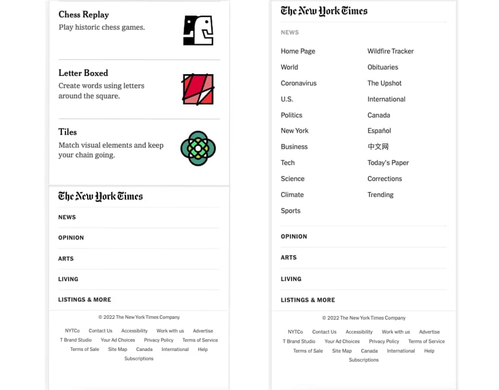
The New York Times has a really extensive mega footer, but it has found a functional solution for the mobile footer.
- Put Order First: If there are several links, it’s better to organize them into columns, possibly with a small title above each column indicating the topic they group together.

- Embrace Empty Space: Leaving negative spaces helps create a sense of order and improves readability. Don’t succumb to the temptation of filling your footer with elements just to make it appear richer!

- SEO and User Experience: The texts in the footer can be optimized for SEO by inserting relevant keywords and utilizing the network of links to increase user engagement on your site. However, remember that “too much is not good” on the web. Inserting an excessive number of keywords (“keyword stuffing”) or links in an attempt to rank on Google won’t work and might even penalize you. A great trick to avoid overdoing it is to always consider user needs and consequently, the user experience (UX).
- Play with Design: Mega footers are gradually becoming a trend in web design. In fact, their placement at the bottom shouldn’t be a reason to make them anonymous! The footer can be an additional design aesthetic element, but let’s remember that design without UX is just a superficial embellishment. Pay attention to contrast, readability, and ease of navigation!

In Conclusion
It’s easy to underestimate the importance of optimizing the footer when it comes to your website.
In this article, we’ve provided reasons not to underestimate the influence this element can have on users’ browsing experiences and to consider it as an opportunity to enhance your website.
For a great user experience, your pages should be welcoming and functional from start to finish!
After all, as the saying goes, ‘Dulcis in fundo,’ or rather, in the footer!
Table of contents